Unitx

Unit X: Metamorphosis developing & finalising 2

Filled with courage i could knock the second set of book covers out of the park thanks to the success of the first set i, i wanted to go for a somewhat similar look, very minimal objects and quite central composition with an emphasis of the style. Using the painter look with rough brush strokes and dark colours.

Untitled-1.jpg

At the start of the piece i could already feeling it fall apart but i made sure to push through it was only until i got the curtains in and the base colour of the chair that i started to feel much more confident about the piece. Adding the light beam and highlights to the chair further cemented my faith in the painting and at this point i started having fun. Adding highlights around the shadow cast on the floor and floating dust to give is more atmosphere the piece was coming to a close and i can say i’m again happy with the outcome.

Untitled-4.jpg

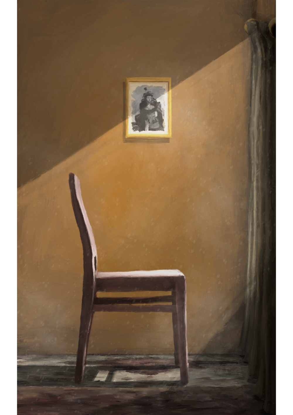
Its very minimal in the sense that the most exciting thing about the picture may be the chair or photo frame in the back but my focus wasn’t on the objects more the atmosphere the room had and i think in that sense i think i succeeded.

Untitled-2.jpg

Onto the back cover now and i think its probably worth noting that i was just trying to push this one out of the door. This being my last week preparing for the hand in it is all systems go for planning and constructing two portfolios. the painting isn’t terrible but it hasn’t had the same treatment of carefully planning out its composition or atmosphere. Using mostly assets from other paintings the only thing genuine about it would be the shading and the shadows.


Untitled-3.jpg

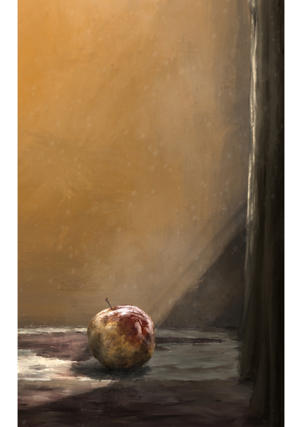
Suppose the main purpose of the the back cover would be the synopsis and a few quotes from other writers and publishers. But out of the two i think i prefer the first rendition of the back cover, granted i should of stretched out a little and experimented but time just isn’t on my side in this instance.

Next would be to stitch these two images together, include a spine and add some text to get a final idea at how these would be look on the book. Exciting!

Unit X: Lab grown meat

One thing I had forgotten about was a mini side project that I set myself way back when I was doing the TED articles and that was lab grown meats. I flicked through my sketchbook to find I had already put in the article and highlighted a few key words so I thought I owed it to myself to carry it on and see what results from it, nothing would be polished or finished and seems as if it’ll only take me a few extra days I though why not and got cracking turning them into digital.

The first idea I got was taking the phrase ‘Lab grown meat’ quite literally which resulted in me drawing a test tube with meat inside of it.

Untitled-4.jpg

It was incredibly enjoyable process as I’m sticking to my guns on the minimalist illustration approach. I used a few images of reference to try and truly capture the lighting on the test tube and whilst I think I captured that perfectly I cannot say the same toward the meat, I suppose once you stir long enough at it, it becomes more and more unsettling and perhaps could of done with a few renditions or practice to try and capture the meat in a minimalistic style. Final 4.jpg

The finished piece is captivating, how long for is up for debate but I think its a step in the right direction at mastering this minimalistic voice I have adopted, each one of these illustrations is a lesson on which techniques, brushes, shapes and colours to use. Looking at it with context I don’t think that it says ‘Lab grown meats’ but is a little victory for me given my past creative voice.

Next up is a very similar idea to this one however in a different piece of science equipment, more to try out and practice trying to get the sludge in the centre on the glass container to resemble something that looks like meat. Untitled-5.jpg

However think I have missed the mark way more than the first rendition, in my opinion this idea and piece is all sorts of wrong and couldn’t wait to just chuck it aside, however I pushed through and told myself ill throw it in my portfolio, most certainly not my professional one. Final 5.jpg

Trying to glamor it up with a spotlight and little white border but nothing could save this monstrosity. I think trying it again just drained me as I near enough did it perfectly first time around so you could say I was burnt out, I hadn’t put the same amount of attention to detail in the glass container I had done in the first piece and had an underlying feeling that the idea wasn’t strong enough to begin with in the first place which resulted in a rushed and un-enthusiastic finished piece, Lets move on shall we.

And to finish the day would be another disappointing outcome that to em felt like a complete waste of time. Untitled-2.jpg

I knew full well this would be the go to idea for this topic and just wanted to try my own rendition of it to see if it could speak for itself and be a sort of a representation of my voice and my style however it fell flat on its face very quickly. Trying out an isometric look this time just burnt me out quicker and got me frustrated. Again just wanting to throw it aside and in my portfolio never to be seen again, I can’t say I had learnt anything from these past two illustrations aside from the fact I’m navigating and getting to know the software that is procreate much better and quicker which is beneficial. Got to take a win where ever you can!

Unit X;Back at it again

After my last stressful encounter with trying to create my last piece of art i thought after nearly 7 months of strenuous work i decided i deserved a little east break which coming back from and back into work i found quite difficult but after a few coffees and forcing myself to sit at my desk and knock something out i had a result and not necessarily a good one. Using my last post as context i was planning on using raw materials other than digital work, well that fell flat on its face the second i came back round to trying it again. IMG_0248 Almost immediately after starting it my confidence and motivation hit an all time low yet again, and with the deadline for this project drawing nearer i couldn’t put it off for another 2 weeks, something had to be painted one way or another. So i jumped back on my trusty graphics tablet (No hard feelings pal) and without any hesitation or planning i opened a blank page on photoshop and got right to it, using the same colour scheme i used for this poor acrylic painting. i thought i would use vanishing points this time for painting maybe tat will take the edge off and get the look i’m going for and lord behold it payed off.

We are maps 1

Prior to his painting i had found a new brush preset on photoshop that i thought i would give a try, i liked the look and the texture as enlarged it gives the effect that it has been done using crayons or pastels which i thought fitted in nicely. keeping it rough and quick it took me overall about 30 minutes to an hour and illustrates the basic concept of what i wish to achieve hopefully for my final piece. This concept in general has already undergone 4  developments and i think it may be the winner however i cant speak too soon as i still want to delve into more of the pop up ads in in-convenient places maybe using this brush or with my now re-kindled sense of motivation and productivity.