Looking back on my list of things in trying to find some inspiration, I realised I haven’t had a stab at a book cover since graduating University. I started to think of possible books in which I could illustrate. I have recently started listening to audiobooks whilst in work, although not many as I can only listen to them in short intervals before being asked to do something, one of the books that I thoroughly enjoyed was Chuck Palahniuk’s Fight Club. Once I locked onto the idea of this being the book cover I wanted to recreate, I started going through key moments and the finer details. I wanted the end result to be a cover in which would make much more sense once the audience had finished reading the book, as a somewhat reward to the reader.

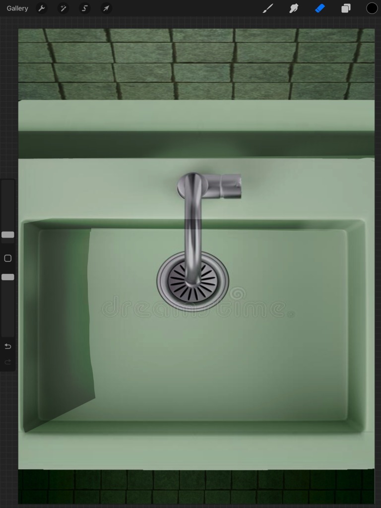
It all started with a sink, I wanted to tap into the colour palette of the film, keeping its nior feel. This was going to be another composite photo bashing piece to begin with, as this lets me quickly build the base of the illustration to give me a rough idea of how my vision would look and let’s me decide if it is any good.

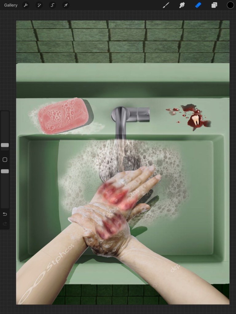
Next up are the bloody knuckles washing with a bar of pink soap and a bloody tooth. The soap plays a key role in both the book and the film, so it only felt right to choose the colour as pink. I only chose one tooth in the end as I didn’t want to overdo it, leaning into the ‘Less is more’ way of thinking. Additionally, not wanting to overdo it on the gore, as the next process shot will show you.

Blood, blood and more blood. Following again in the footsteps of both the film and book, gore and violence constantly occur throughout and I wanted to portray and illustrate that here. So far, this is where we are currently sitting at. Overall, as a composite guide, I am happy with the composition and the story in which I am trying to show. On the other hand, there may be a few details that I intend to change/add, making the next step painting and polishing this piece, while additionally adding some text.