design

Animation

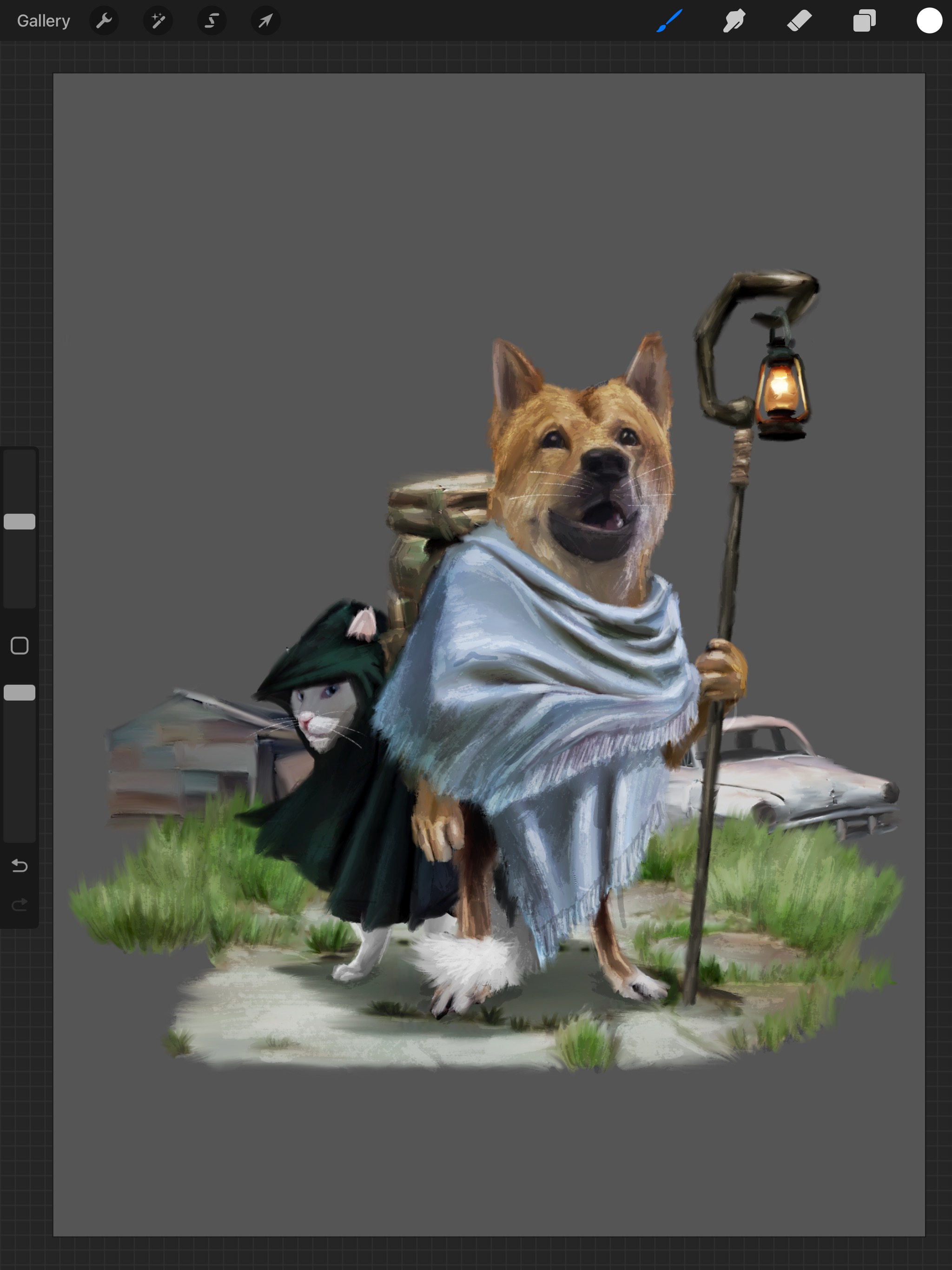
Listening to my illustration podcasts and looking at what skills employers are looking for, it has become clear that having experience in animation goes a long way. Considering that I have a degree in animation & illustration, I thought it would be best to give it another crack. Since I shamefully have little skill and knowledge of the subject, I wanted my first animation to be simple; meaning I slowly learn the basics and not burn myself out with an overly ambitious project. I figured that the style of illustration I am working on will be perfect for my first animation. I had the idea of just illustrating a pair of eyes blinking and moving about, showing different facial expressions and emotions.

I decided to do this project on Photoshop, as I thought a little extra computing power animating each frame would go a long way. However, by the end of the animation even the computer started to struggle to keep up. Unfortunately, due to WordPress’s premium band, I am unable to upload the animation here. Despite this, it can be viewed on my instagram at: https://www.instagram.com/lead_eraser/

The process was quite therapeutic and not as stressful as i imagined it would be. However, that may be due to the simple idea I had put in place. As simple as it was, I had figured out some of the basics of animation; such as how to animate certain emotions and completing the motion of the pupils and eyelids. The time frame didn’t take me too long either, just clocking over two hours – compromising of 136 frames with a run time of 11 seconds. Overall, I am pretty happy with how it turned out and am excited to jump back in and the thought of it getting a little more complicated as I go. Paired with the new style of illustration I am working on, I think i will be able to carve out a distinctive voice for myself, which is equally as exciting.

FightClub Cover Illustration #2

And we are back to finish off the FightClub cover illustration. A design in which has been pushed aside these past few days, as I’ve been getting busy in developing my style, after which made it honestly quite a struggle to get back into this illustration. I think this due to the fact that I can see myself improving on my own style and am keen to go further with it. Therefore, it’s been hard to want to put that down for a second and finish this off, but alas it has finally been completed.

Above is the composition I ended up settling on for the cover. Once I had it all in place, I used the smudge tool with a turpentine brush, giving it a rough painted effect. I have used this method for a few years now, so it’s safe to say that I made quick work of it, even including the highlight overlay layers. However, the closer I got to the end, the more rushed it became, as I just wanted to see the back of this piece. This was not because I was unhappy with it, but maybe due to me staring at it for too long. Additionally, as previously mentioned, I was keen to get back to developing my own style.

Highlights and darks done! I remember listening to an illustration podcast not too long ago and they mentioned how using a noise layer on-top of an image can really tie it all together and to my pleasant surprise, it turned out to be true. It is ever so slight, but it brings all the levels and colours together, as well as fitting into the gritty theme of the book.

I find that the text really does give it that finished authentic feel, even though the whole process and time taken was far from professional. The font choice was near enough a battle between which one looked the cleanest and I feel as though I have chosen correctly. That is one thing I often forget in which is difficult while creating book covers, is how important the used font is. I believe this choice is just as important as the image itself in portraying the feel of the book. Looking at the finished image, I am happy with the outcome. Overall, it certainly could have turned out a lot worse, but all in all it has been nice to flex them conceptual muscles and take a stab at a book I very much enjoyed.

Experimenting with style

Listening to illustration and creative podcasts whilst at my full time job, I am always hearing about style and how creators develop it. I spent all my time in higher education trying to find my style, and even after 6 years, I unfortunately came no closer to finding it. I realise now that in order to make it as a freelance illustrator, this is something that I will need to develop and I think it’s about time that I started putting the pieces together. I thought back to my time at MMU, trying to remember which process of illustration I enjoyed doing the most and decided in the end that it was this 2D graphic style.

I felt like this was the closest I had gotten to my own style, as it combines the technical precision I strive for, with the additional flat colourful graphic style I like the look of. However, in retrospect I see that it is pretty generic and doesn’t stand out as an individual voice. Despite this, I do remember thoroughly enjoying the process and therefore, decided to start here.

I had this idea for an illustration some time ago, as it depicts a brain in some weighing scales. The meaning behind it being ‘heavy thoughts’ and as dark as the meaning is, I thought it would be an ironic that this be portrayed in a bright and clean graphic style. I started with block shapes, along with a colour palette, which helped speed up the process of choosing colours for the design. The image in progress somewhat implementing my Product Design GCSE, as I found myself thinking of how the scales would look and work as if they were real. Once I had the the design down, I went in adding overlay layers, painting in darks and lights with a new brush I found in procreate.

Looking at the finished piece, I couldn’t be more pleased and satisfied with the outcome. I feel like I developed a little further in finding my style, as this was an incredibly enjoyable process. Completed in just over an hour, I believe the illustration looks clean and is up to a professional standard. While additionally feeling more unique and personal in what I want to say.

Fight Club Cover Illustration #1

Looking back on my list of things in trying to find some inspiration, I realised I haven’t had a stab at a book cover since graduating University. I started to think of possible books in which I could illustrate. I have recently started listening to audiobooks whilst in work, although not many as I can only listen to them in short intervals before being asked to do something, one of the books that I thoroughly enjoyed was Chuck Palahniuk’s Fight Club. Once I locked onto the idea of this being the book cover I wanted to recreate, I started going through key moments and the finer details. I wanted the end result to be a cover in which would make much more sense once the audience had finished reading the book, as a somewhat reward to the reader.

It all started with a sink, I wanted to tap into the colour palette of the film, keeping its nior feel. This was going to be another composite photo bashing piece to begin with, as this lets me quickly build the base of the illustration to give me a rough idea of how my vision would look and let’s me decide if it is any good.

Next up are the bloody knuckles washing with a bar of pink soap and a bloody tooth. The soap plays a key role in both the book and the film, so it only felt right to choose the colour as pink. I only chose one tooth in the end as I didn’t want to overdo it, leaning into the ‘Less is more’ way of thinking. Additionally, not wanting to overdo it on the gore, as the next process shot will show you.

Blood, blood and more blood. Following again in the footsteps of both the film and book, gore and violence constantly occur throughout and I wanted to portray and illustrate that here. So far, this is where we are currently sitting at. Overall, as a composite guide, I am happy with the composition and the story in which I am trying to show. On the other hand, there may be a few details that I intend to change/add, making the next step painting and polishing this piece, while additionally adding some text.

Morgan & the Hunter

After the weekend off and having nursed the copious amounts of food and alcohol out of my system, I was right back into my routine, with no less ambition and excitement than the day I started. Having my list of things to draw and having the day to think about it, I came up with a concept of what I wanted to paint. Knowing I wanted to create something regarding animals, I thought why not use my sister’s gorgeous pets as the basis for two characters, the cat named Morgan and the dog named Hunter.

I started off by sketching a rough outline of that of the positioning of the characters and with collecting some images of my sister’s pets, I got to work doing a composite.

Bashing multiple photos together from my photo album and google images, I was starting to see how the painting was coming together. Once I had everything I wanted within the image, I then used the smudge tool and a pen brush to give it a traditional painted texture, which I feel really started to tie the painting together.

Using multiple layers of highlights and darks, I started to build up some depth and detail of the painting. I was really pleased with how it was looking, which is always a relief as the first few stages of creating artwork this way can be a very sore sight, but yet again it was having faith in the process.

Looking at the finished image, I am pleasantly surprised with how it turned out. Due to this technique being one I haven’t used in quite some time, I was worried I had forgotten some of the tricks needed in order to pull the artwork together. However, it came pretty close to how I had visualised it within my head. In my opinion, I believe I managed to create two interesting characters in the form of my sister’s pets, even going as far as to name the duo Morgan & the Hunter. The duo are set in a post apocalyptic world, relying on each other for survival. Overall, I hope my sister enjoys the image just as much as I did creating it.

Drawing Challenge #3

Todays drawing challenge consisted of using the pencil brush to achieve a sketch like approach. As my last painting was all about colour and scope, I wanted something contrasting to this – a little more basic and simple. I had scrolled through instagram and pinterest for inspiration, finding a few subjects to use as reference, as I wanted the process to be relaxing and free flowing. Unfortunately, I didn’t take any process images as it came together pretty fast, but here we have the result:

As you can see the final piece is pretty basic, but it was a breath of fresh air to go in rough without doing any touch ups. Despite initially wanting to use this sketch as the base for an upcoming self portrait idea, there isn’t any given meaning behind the end result. This is due to the direction in which the sketch took; once drawn out I saw the bodies as rather menacing, whilst only later when adding the heads/faces to the figures did I realise that I wanted this to look like a sort of line up. During the process, I accidentally enlarged the head on one of the men, giving it a slight hint of style in which I liked the look of – so I applied to all.

This was a difficult one in terms of suppressing my inner perfectionist, as I wanted to go over and redo nearly every single line and detail, but I managed to make it through in just over an hour. Overall, I like the final look of the piece. However, I think I may have to revisit sometime to give it a little polish and more time.

Guess who’s back (back again)

Well isn’t this strange… I can’t say I would have ever seen myself coming back here to post, as it was used primarily for educational purposes to self reflect on my projects at college and university. However, after a long hiatus and time away from not only this website but illustrating in general, I find myself craving the structure and the gratification of expressing my thoughts and processes on creating art. I am here to get back into that creative routine, to be critical and reflective, to understand mistakes/areas I could improve in, explain ideas and set projects. Overall, to get me back into a productive mood to which I can use to carve my career and get back into the industry.

Now that I don’t have the safety net of education to help drive me to be productive, I have made sure to create somewhat of a routine to keep me busy throughout the week. This compromises of daily drawing challenges, taking on freelance work and setting ongoing projects for myself. However, as it has been some time since I have been this productive, I have made a point to not strain myself – this is where my first daily illustration comes into it.

These are some of the topics I have set myself to draw day to day. I wanted to set myself an easy one to begin with to ease me back into the routine, so I decided to start illustrating a cartoon character, trying to push a stylistic approach.

The programme I am using is Procreate on my 2018 iPad pro, a little dated and slow, but it gets the job done nevertheless. The time frame i set myself was an hour, so I got to work on choosing a colour palette and sketching out a rough outline of the character I wanted to create.

Once I had a rough guide, I went in defining the lines to make it easier to paint, remembering the idea was not in detail or to show skill, but to get me used to the process and learning to stick with it. Things happened pretty fast after this point, as trusting the process became pretty exhausting and the pressure to create something somewhat bearable to look at was pretty stressful. Despite this, I pushed on, but unfortunately completely forgetting to document the stages.

In the end, it came out pretty meh… not entirely disappointed, but not exactly thrilled to look at it either. Although, the aim of these illustrations is to drop the expectation and pressure to create masterpieces and to just help get ideas out, as well as practicing my drawing skills. In that sense, I suppose it’s pretty okay, not a bad start. There is a lot to improve on here, but all that will come, for now it’ll do as an introductory piece back into the routine of a creative.

Unit X: Metamorphosis developing & finalising 2

Filled with courage i could knock the second set of book covers out of the park thanks to the success of the first set i, i wanted to go for a somewhat similar look, very minimal objects and quite central composition with an emphasis of the style. Using the painter look with rough brush strokes and dark colours.

Untitled-1.jpg

At the start of the piece i could already feeling it fall apart but i made sure to push through it was only until i got the curtains in and the base colour of the chair that i started to feel much more confident about the piece. Adding the light beam and highlights to the chair further cemented my faith in the painting and at this point i started having fun. Adding highlights around the shadow cast on the floor and floating dust to give is more atmosphere the piece was coming to a close and i can say i’m again happy with the outcome.

Untitled-4.jpg

Its very minimal in the sense that the most exciting thing about the picture may be the chair or photo frame in the back but my focus wasn’t on the objects more the atmosphere the room had and i think in that sense i think i succeeded.

Untitled-2.jpg

Onto the back cover now and i think its probably worth noting that i was just trying to push this one out of the door. This being my last week preparing for the hand in it is all systems go for planning and constructing two portfolios. the painting isn’t terrible but it hasn’t had the same treatment of carefully planning out its composition or atmosphere. Using mostly assets from other paintings the only thing genuine about it would be the shading and the shadows.


Untitled-3.jpg

Suppose the main purpose of the the back cover would be the synopsis and a few quotes from other writers and publishers. But out of the two i think i prefer the first rendition of the back cover, granted i should of stretched out a little and experimented but time just isn’t on my side in this instance.

Next would be to stitch these two images together, include a spine and add some text to get a final idea at how these would be look on the book. Exciting!

Unit X: Metamorphosis research & development 2

Realising that all my ideas had ran dry I decided to over look my 24 images that I recently produces and pick what I thought would be the best contenders. I picked out 7 images but combines two as they both had a similar subject. So there being 6 images I chose from I drew out another 24 blocks however this time I would assign 4 blocks to one idea and develop them in different compositions to winkle out a final idea that I was happy with at least. These are very rough sketches given I don’t have time to dawdle on small details, that’s for later development.

Once I had finished 24 development sketches I then went over them and picked what I found to be 4 illustrations that I think would look good on the book cover, combining two illustrations to be the front and back of the book and the spine shouldn’t be that hard to design, I’m thinking of making a small graphical illustration to accompany the text on the spine which shouldn’t take long to design and develop.

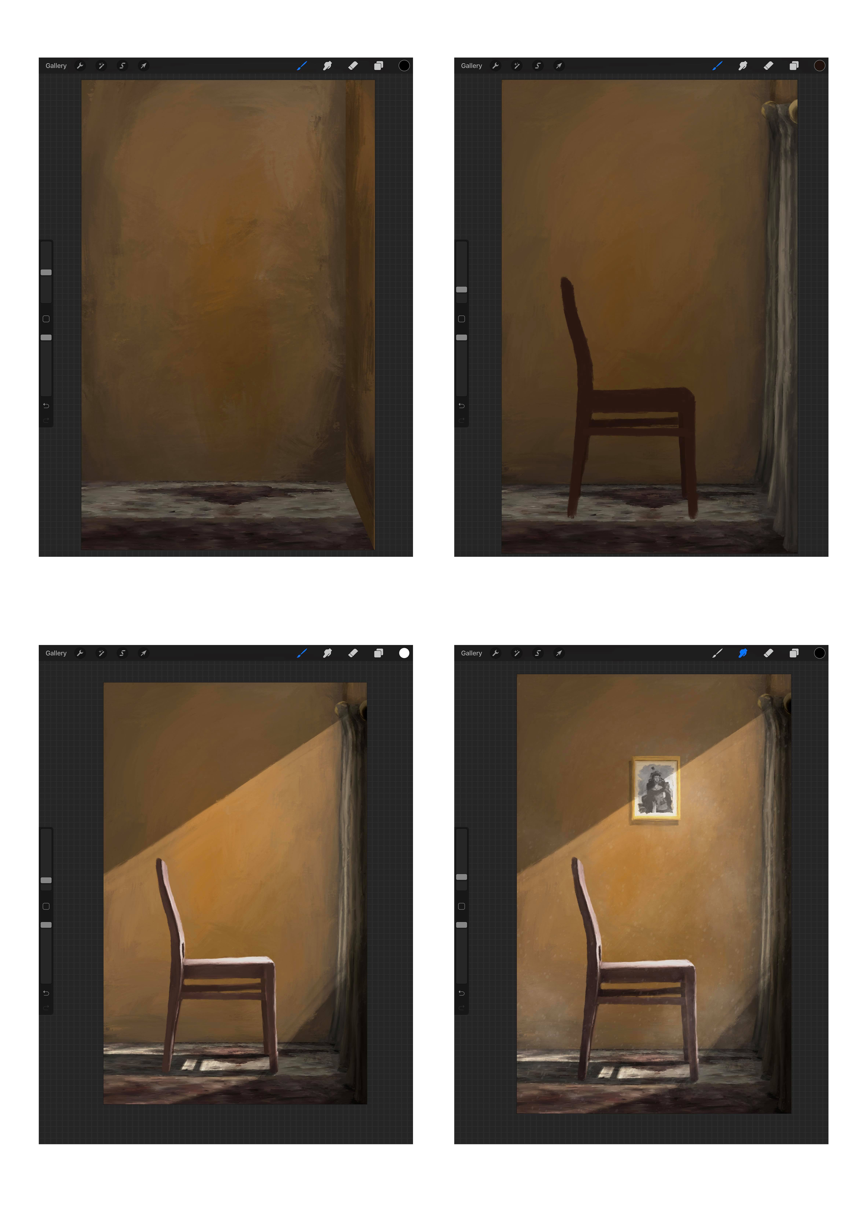
this being the first set that I wish to illustrate, I didn’t want it to be overwhelmed with detail as I can feel my inner minimalist designer talking and saying keep it simple. The colours I thought would be a nice touch to give it a better sense of how I envision it to be however the colours aren’t final, even though I am liking the look of them. The front cover depicts Gregor the main character in the beginning chapters crawling over his beloved picture he keeps framed in his room and doesn’t want everyone to remove. I also think this works great for attracting a reader that hasn’t read the book as it doesn’t give much context to what the book it about but later can become appreciated upon reading the book.

The next idea which is equally rough if not more. Thinking the use of colours is what made this look a little harsh but I felt a sense to include them seems as if I did on the previous. The colours I can say on this one are certainly not final but more of a experimentation of playing around with the lighting I want to try and achieve in this illustration. As you can see I’ve included text boxes on where I want the title and authors name. It depicts the chair that Gregor sits on to look out of his window and on the back is to me what I had hoped to look like is an apple shape but with Gregors vermin type back, a mixture of sumo Lisa. Not sure if this idea is as strong as the first but either way they will both be taken into digital to be painted up which will spruce them up and look more refined. These are more guidelines and tests for composition and colour.

Unit X: Metamorphosis research & development

And here are at the final project that my remaining two weeks at uni will be focused on, Metamorphosis. A short story following the events of a salesman that wakes to find himself turned into a vermin. An interesting read however on the first read through can’t say I was floored by the book but re-reading found new ways to understand it to find out the meaning and protagonists of the book changed. Upon finishing the book the first time it was safe to say I was excited to get started on designing the book cover with so many ideas flying around my head, so I thought it would be useful of myself to re-read it and highlight any key descriptive words about a scenario, the looks of a character, or any meaningful objects that play a key point in the story.

Not exactly sure if this was the most efficient way of dissecting a book but it’s the only way I knew how and which made the mode sense, even colour coded it. From these key words I grouped together I drew out 24 little squares and in here would be the first wall to throw ideas at and see what stuck or what I liked the most.

Still not sure this is me running out of ideas or there are still some left but as it stands there are some ideas I like the look of and will certainly need developing. I will select these images and take it in for another round of drawing 24 squares however this time the vast majority of them will be the same idea with minor changes in objects and composition to try and find the cover that best suits the book.