Style

Animation

Listening to my illustration podcasts and looking at what skills employers are looking for, it has become clear that having experience in animation goes a long way. Considering that I have a degree in animation & illustration, I thought it would be best to give it another crack. Since I shamefully have little skill and knowledge of the subject, I wanted my first animation to be simple; meaning I slowly learn the basics and not burn myself out with an overly ambitious project. I figured that the style of illustration I am working on will be perfect for my first animation. I had the idea of just illustrating a pair of eyes blinking and moving about, showing different facial expressions and emotions.

I decided to do this project on Photoshop, as I thought a little extra computing power animating each frame would go a long way. However, by the end of the animation even the computer started to struggle to keep up. Unfortunately, due to WordPress’s premium band, I am unable to upload the animation here. Despite this, it can be viewed on my instagram at: https://www.instagram.com/lead_eraser/
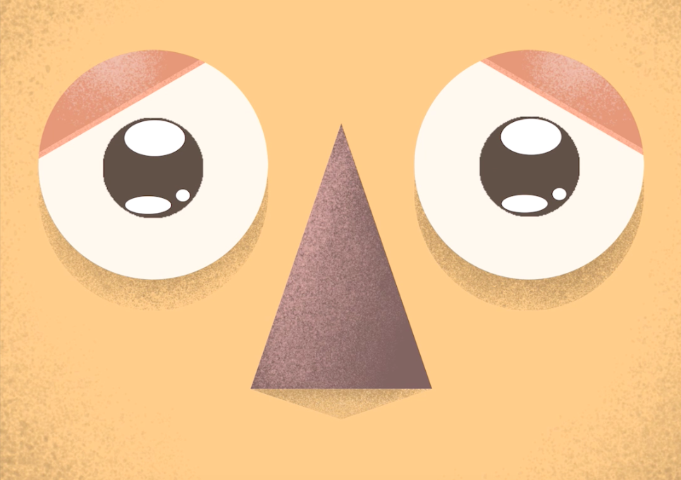
The process was quite therapeutic and not as stressful as i imagined it would be. However, that may be due to the simple idea I had put in place. As simple as it was, I had figured out some of the basics of animation; such as how to animate certain emotions and completing the motion of the pupils and eyelids. The time frame didn’t take me too long either, just clocking over two hours – compromising of 136 frames with a run time of 11 seconds. Overall, I am pretty happy with how it turned out and am excited to jump back in and the thought of it getting a little more complicated as I go. Paired with the new style of illustration I am working on, I think i will be able to carve out a distinctive voice for myself, which is equally as exciting.

Experimenting with style #2

After yesterday’s successful turn out experimenting with a new style, I was eager to jump back in and play around with colour, shapes and shading.

Starting out, I made it a rule not to over complicate the sketch. Using basic shapes such as rectangles and circles was my go to, I realised with wanting to come up with a new style there are some rules that I need to set myself in order to stay consistent. I did initially want to illustrate a single character, as I thought that once I had that initial style down that I could use the same techniques on other future subjects. However, I had the thought of this image instead and believed it was too good to pass up.

I thought I would split both of the characters in this illustration and try a different technique for each. In order to achieve this, one of the characters was created using a pencil tool to draw the shapes (Rabbit); giving it a fuzzy feel in which I think was a good way to illustrate the texture of the animal’s fur. Whereas with the carrot, it was fabricating straight edges and distorting shapes in order to attain its clean look.

This was where I wanted to leave the illustration. However, after taking a few minutes looking at it, it felt wrong having them on a floating island and didn’t exactly ground them (pun unintended). Because of this, I decided to extend the ground to the borders of the canvas. Therefore, finishing with this:

Much better. It was a fun process creating this piece and I believe that is key in finding my style. As I said yesterday, for this to be my voice it needs to be one that I enjoy doing and today was no different. The palette I thought was made up of some pretty basic colours. Despite some colours popping much more than others, the overall goal was to experiment with style. Additionally, I like how both characters have different textures applied to them, as it gives me a better idea on what I want my original style to look like. The carrot I think being the style in which I prefer. However, it is nice to know that if I do want to illustrate fuzzy creatures in the future, I now know how to using a pencil for that texture.

Experimenting with style

Listening to illustration and creative podcasts whilst at my full time job, I am always hearing about style and how creators develop it. I spent all my time in higher education trying to find my style, and even after 6 years, I unfortunately came no closer to finding it. I realise now that in order to make it as a freelance illustrator, this is something that I will need to develop and I think it’s about time that I started putting the pieces together. I thought back to my time at MMU, trying to remember which process of illustration I enjoyed doing the most and decided in the end that it was this 2D graphic style.

I felt like this was the closest I had gotten to my own style, as it combines the technical precision I strive for, with the additional flat colourful graphic style I like the look of. However, in retrospect I see that it is pretty generic and doesn’t stand out as an individual voice. Despite this, I do remember thoroughly enjoying the process and therefore, decided to start here.

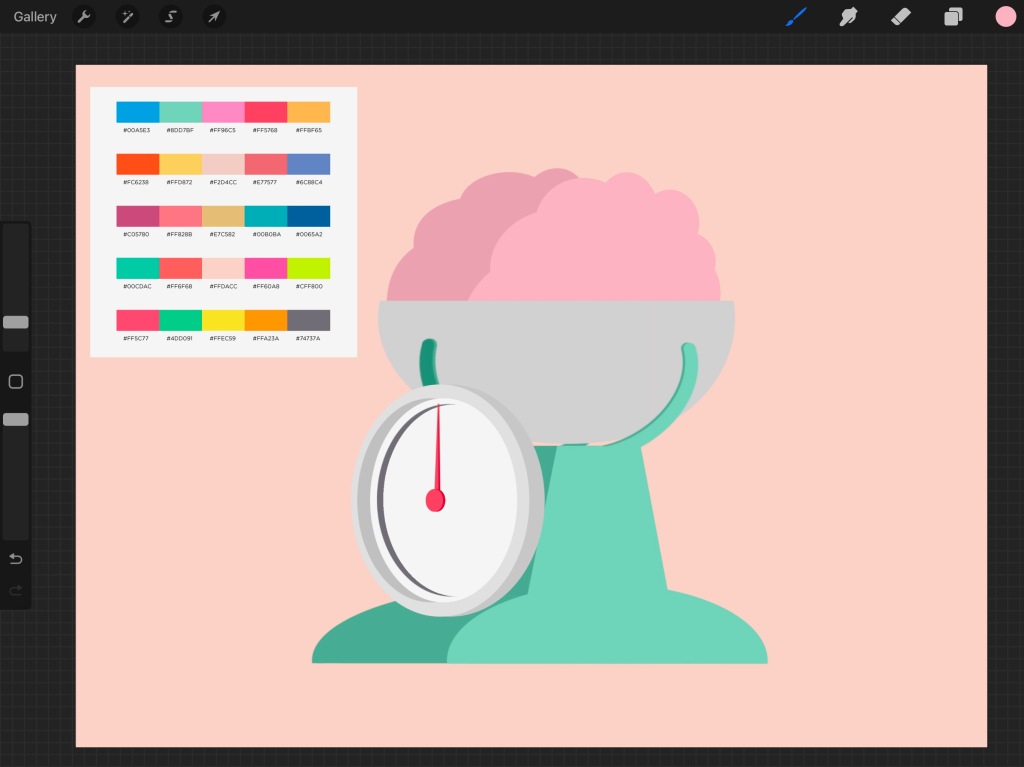
I had this idea for an illustration some time ago, as it depicts a brain in some weighing scales. The meaning behind it being ‘heavy thoughts’ and as dark as the meaning is, I thought it would be an ironic that this be portrayed in a bright and clean graphic style. I started with block shapes, along with a colour palette, which helped speed up the process of choosing colours for the design. The image in progress somewhat implementing my Product Design GCSE, as I found myself thinking of how the scales would look and work as if they were real. Once I had the the design down, I went in adding overlay layers, painting in darks and lights with a new brush I found in procreate.

Looking at the finished piece, I couldn’t be more pleased and satisfied with the outcome. I feel like I developed a little further in finding my style, as this was an incredibly enjoyable process. Completed in just over an hour, I believe the illustration looks clean and is up to a professional standard. While additionally feeling more unique and personal in what I want to say.