Realising that all my ideas had ran dry I decided to over look my 24 images that I recently produces and pick what I thought would be the best contenders. I picked out 7 images but combines two as they both had a similar subject.  So there being 6 images I chose from I drew out another 24 blocks however this time I would assign 4 blocks to one idea and develop them in different compositions to winkle out a final idea that I was happy with at least. These are very rough sketches given I don’t have time to dawdle on small details, that’s for later development.
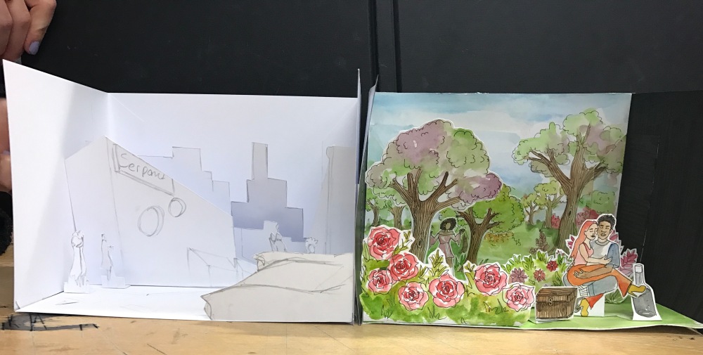
Once I had finished 24 development sketches I then went over them and picked what I found to be 4 illustrations that I think would look good on the book cover, combining two illustrations to be the front and back of the book and the spine shouldn’t be that hard to design, I’m thinking of making a small graphical illustration to accompany the text on the spine which shouldn’t take long to design and develop.
 this being the first set that I wish to illustrate, I didn’t want it to be overwhelmed with detail as I can feel my inner minimalist designer talking and saying keep it simple. The colours I thought would be a nice touch to give it a better sense of how I envision it to be however the colours aren’t final, even though I am liking the look of them. The front cover depicts Gregor the main character in the beginning chapters crawling over his beloved picture he keeps framed in his room and doesn’t want everyone to remove. I also think this works great for attracting a reader that hasn’t read the book as it doesn’t give much context to what the book it about but later can become appreciated upon reading the book.
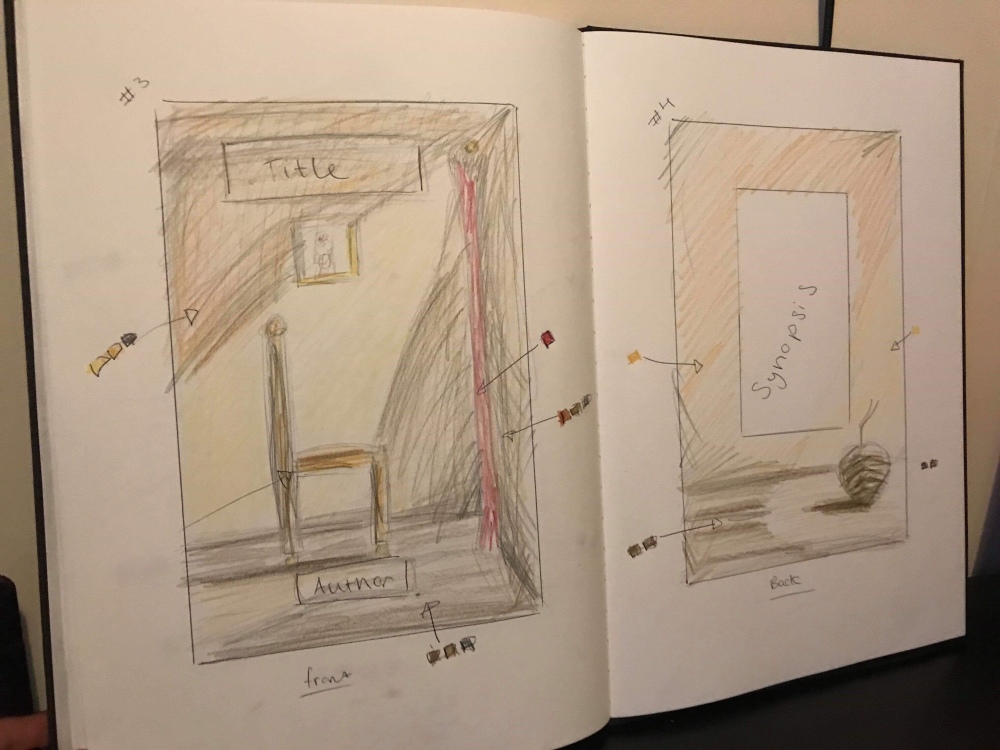 The next idea which is equally rough if not more. Thinking the use of colours is what made this look a little harsh but I felt a sense to include them seems as if I did on the previous. The colours I can say on this one are certainly not final but more of a experimentation of playing around with the lighting I want to try and achieve in this illustration. As you can see I’ve included text boxes on where I want the title and authors name. It depicts the chair that Gregor sits on to look out of his window and on the back is to me what I had hoped to look like is an apple shape but with Gregors vermin type back, a mixture of sumo Lisa. Not sure if this idea is as strong as the first but either way they will both be taken into digital to be painted up which will spruce them up and look more refined. These are more guidelines and tests for composition and colour.
 The idea around this one being a scientist wearing safety equipment to emphasis that he is infect a scientist which hopefully comes across and the reflection of meat in a Petri dish which is one that I had done recently to save time as there isn’t much of that left as it goes. The process for this was rather enjoyable and easy going as I had quite a clear view in my head of what I wanted from it and I would say I succeeded. The idea I think not being the strongest however it does get the point across which I suppose isn’t bad considering that this is an illustration coming from one pencil drawing (which I admit I should of developed a bit more).
 The finished piece I am happy with, the colours are bright fitting in with the previous illustrations I have done for this topic so it could perhaps be seen as somewhat of a set or collection however if that’s going to be an option I should go back and make more links between the pieces but it’s safe to say that now and after being assured by my tutor that I should put this one to bed. Having two weeks left there is no time left to squabble over small details of a topic that isn’t that strong in the first place.


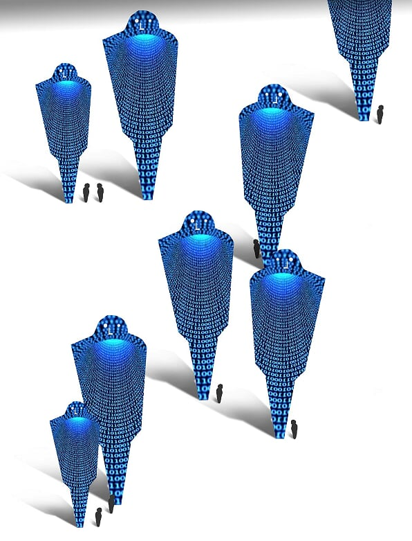
 Me personally preferred the skull without a jaw, subconsciously giving the impression of corruption, and decaying which suited the idea very nicely, i did man renditions of these skulls in various positions and styles but the one i settled on which i like out the lot was this one:
 Accidentally changing the brightness of one of the data skulls left for a cool effect that ends up being the primary image but also fits in the the back ground with the tessellating skulls, plus the font i found by the off chance through Photoshop which fitted in perfectly with the theme!
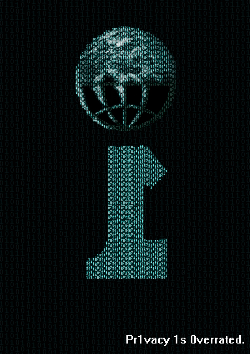
 The last of today’s bunch involves and illustration of a robot, one that would look a little similar to my sketchbook, being in my zone and feeling quite productive after the first few pieces i tackled this with no problem and got exactly the result in which i was aiming for, i did want this piece to be more of a illustration telling a little more of a story mixed with a comic book style with heavy black lines and emotions exaggerated such as the question marks above the head. Today’s session has certainly filled me with confidence and is setting me more onto the right path as well as gaining confidence in my drawing and thought processes, a few more days to go till the end of the year and the exhibit tonight for the years publications of the Unit X project! bring it on!
 Onto the next, I had the idea of lines of code consisting of 1’s and 0’s as code usually is, lines of it sort of mimicking The Matrix but not having the colour green more like a baby blue, however these lines of code would all together form a skull. This idea came to me reading a different article exploring the idea of if terrorists or hacking vigilantes getting a hold of the technology the government has on tracking peoples location and all their data, which interested me the most and this was where i sketched out the most ideas.


 This one exploring the idea of each individuals privacy being at risk with things like ‘Big brother’ and the FBI spying on you, them being representing an shown in the image in a line about to enter what is an IP address to someones computer, a door way. however protection software like Adblock blocking the door way, i’m fully aware that ad block can not stop the government from spying but it was the only logo or symbol i could think of that shows authority and could possibly link in to the ads pathway i’ve been exploring recently.
 This sketch exploring the same idea as the previous one with governments spying and tracking us, this sketch messing around with the google cookies we leave behind, playing around with the concept of the online trails we lead due to google cookies. A fun idea on paper however i don’t think this will transfer well to digital however i am open to try it.
 Reading an article about how there is a bill in congress at the minute in America trying to pass that involves them being able to buy out the publics personal data and to view their internet history and so on, i upon viewing this had an idea of a room full of the most powerful people auctioning off peoples privacy and information which i thought was a great idea, it is expressed well through the sketch and think it would transfer well to digital painting or any other mediums of art
 Another article i read talking about google tracking people with google location services, if switched on can track your every moment and where you are on the globe, an idea most are not happy with which called for me sketching out another idea which i also think transfered well to paper, will most certainly be hitting this one up on photoshop as my mode of thinking at the moment is to branch out and not think about the point of protest being in a select few paintings, maybe a single more empowering image.

 The concept being a phone holding a human, the catch attention and then curiosity would get the better of people asking what the basis is which we would then delightfully explain. I was rather happy the finished outcome and i seem to be the only one out of the group who is, it had been the first time i printed an A1 sized piece which gave me confidence to further do that in the future, and considering the time we had to put this together the fundamentals and meanings of the protest are all there however some parts get a little lost due to some bad artistic choices but all an all it was completed and protested.